
The Risk Radar in Practice
How risks in actual deals were revealed before reality took over.
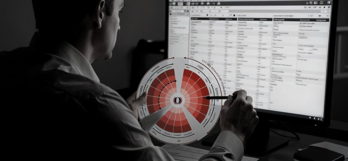
This is The Debrief - a post-game analysis for LPs. Breaking down the plan, the reality, the result, and key takeaways of real deals to better understand risk and invest accordingly.
The Debrief is dedicated to learning how to assess risk. Syndicated real estate is data-heavy and complex. Accurately and comprehensively assessing risk in a deal takes time and skill.
In order to more easily visualize risk, I created the Risk Radar.
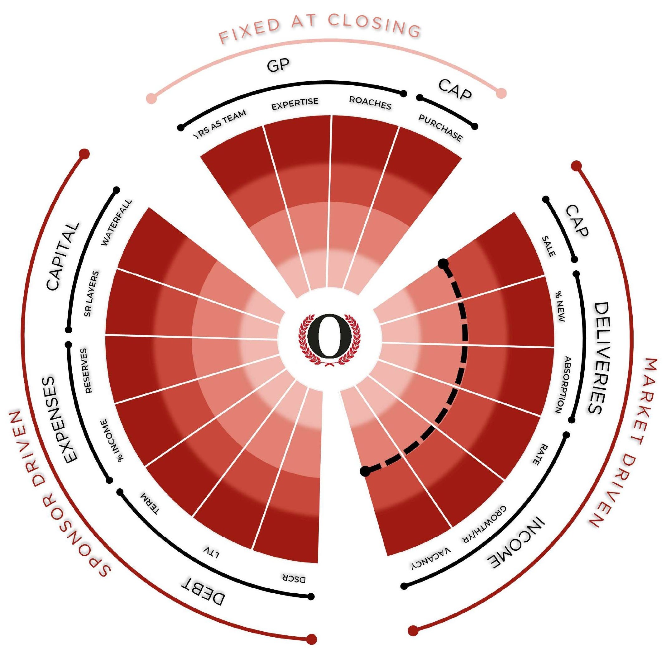
Risk Radar is an educational framework, not investment advice. It’s a visual aid for comparing a deal’s assumptions to historical norms - a prompt for your own analysis, not a rating, a recommendation, or a prediction of any outcome.1
How it Works
I have identified 17 potential breaking points and plotted each as a spoke on the “radar” against historic market metrics and industry norms. The outer ring represents the least favorable/highest risk position for a deal. The innermost ring represents the most favorable/lowest risk position. The closer to the center any given variable lands, the lower the risk. Note that risk is relative: low versus high. There is no risk-free position. Any one of the spokes has the potential to single-handedly lead to a total loss.
For a thorough explanation of how the Risk Radar works, see the introductory Debrief.
In Practice
By plotting pro forma data against long-term high, low, and average values for key metrics and industry norms, a risk profile quickly emerges.
To use the Risk Radar, follow three steps:
Gather the pro forma data for each section shown on the Radar.
Gather contextual data for high, low, and average numbers for each section.
Plot the pro forma number on the radar against the high and low number.
Subscribe to get the upcoming Decoded guide to completing step #2 in the coming weeks.
Does it Work?
I have plotted the data provided in the offering materials on the Risk Radar (indicated by the blue stars) for relevant deals previously covered by The Debrief to see how well the Radar revealed the risk profile and possible breaking points.
Multi-Family
How a Value-Add Became a Total Loss
A 35% increase in NOI wasn’t enough to avoid a 100% loss of investor capital.
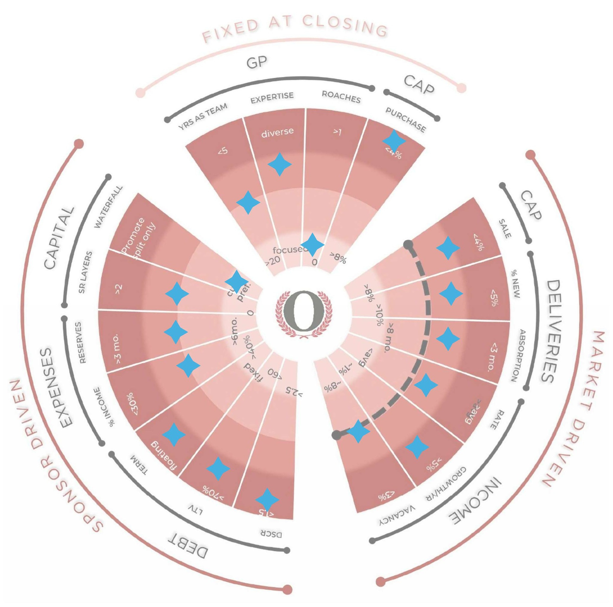
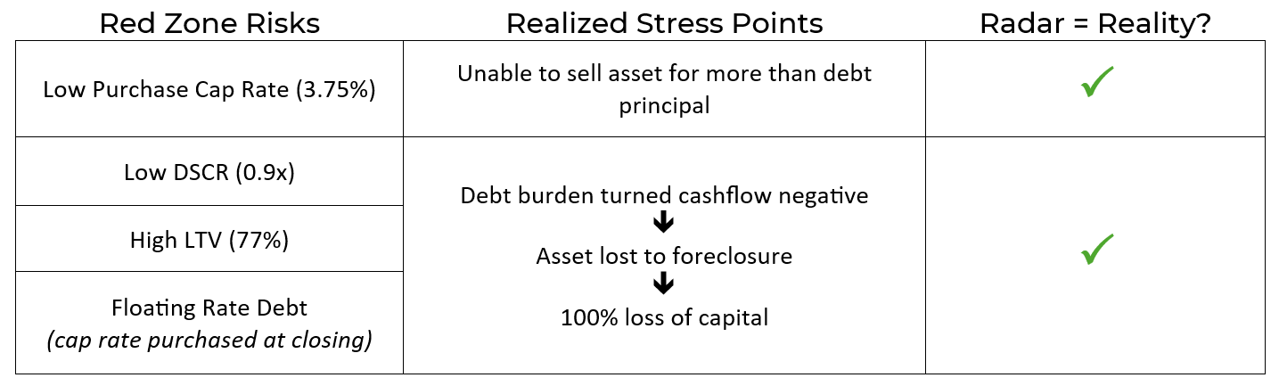
The Risk Radar clearly shows that the asset was purchased at a very low cap rate and that every debt metric is in the red zone upon closing - the stress points which ultimately led to an unrecoverable death spiral of debt, no potential for a sale price in excess of the debt due, and total loss of this deal despite the GP exceeding expectations on every other front.
Crossing the Gap
A joint venture to deliver a ground-up multi-family asset from capitalization through construction, stabilization, and disposition within 36 months.
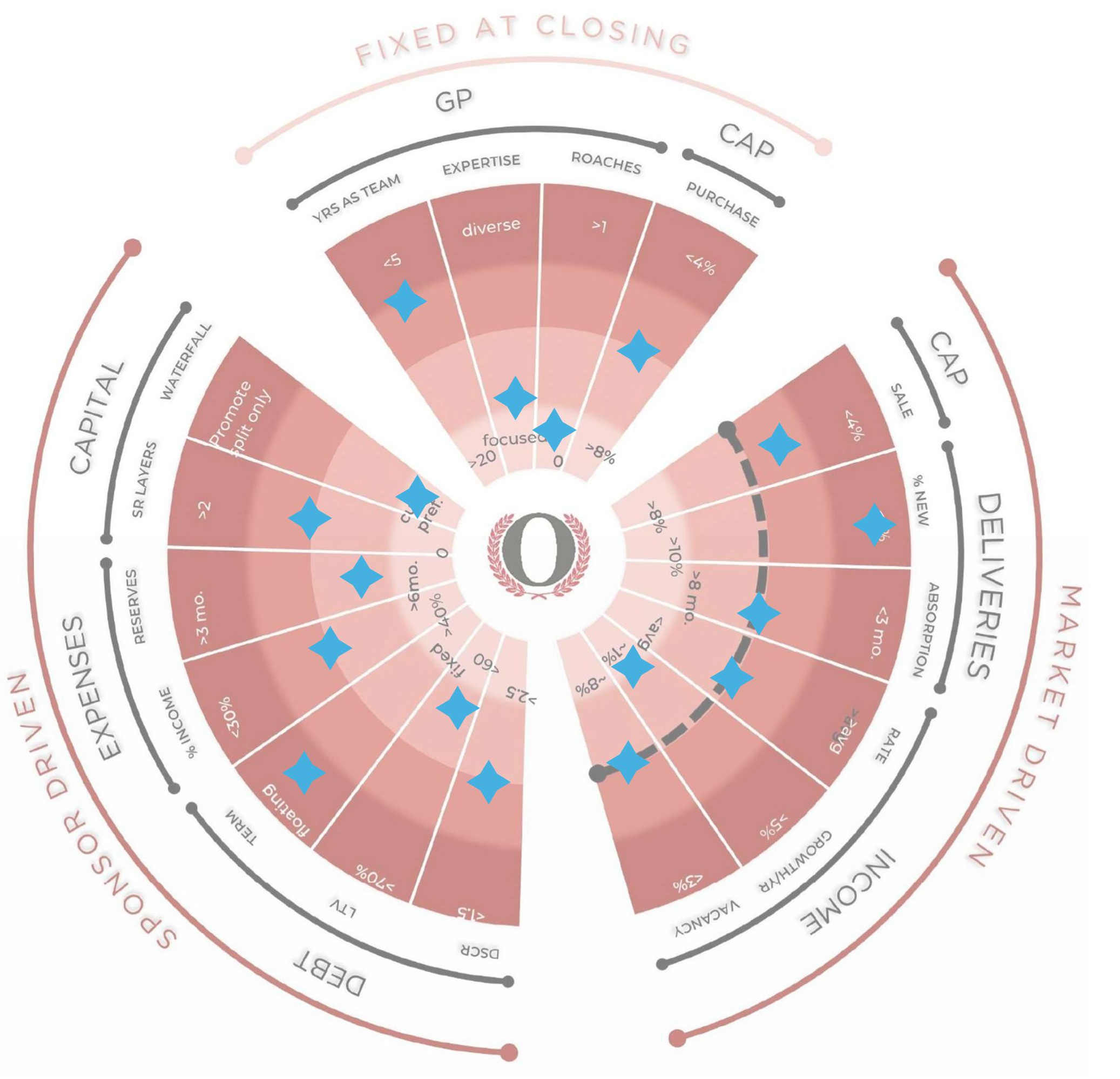
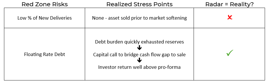
This deal is a good example of a shrewd business plan that was well-executed and captured a strong market environment: the project was sold well in advance of plan - thus outpacing the impacts of the high percentage of new inventory coming to market. Although the high risk of new deliveries was noted by the radar, the GP’s quick execution and sale avoided this possible point of disaster.
However, the floating rate debt quickly depleted reserves despite the otherwise well-crafted and executed business plan. A capital call was necessary to bridge the gap between depleted reserves and a pending sale. As a result, the project was able to survive a brief period of negative cashflow to close a profitable sale and provide returns in excess of the pro forma.
Ripley
Generic value-add business plan for a multi-family apartment complex.
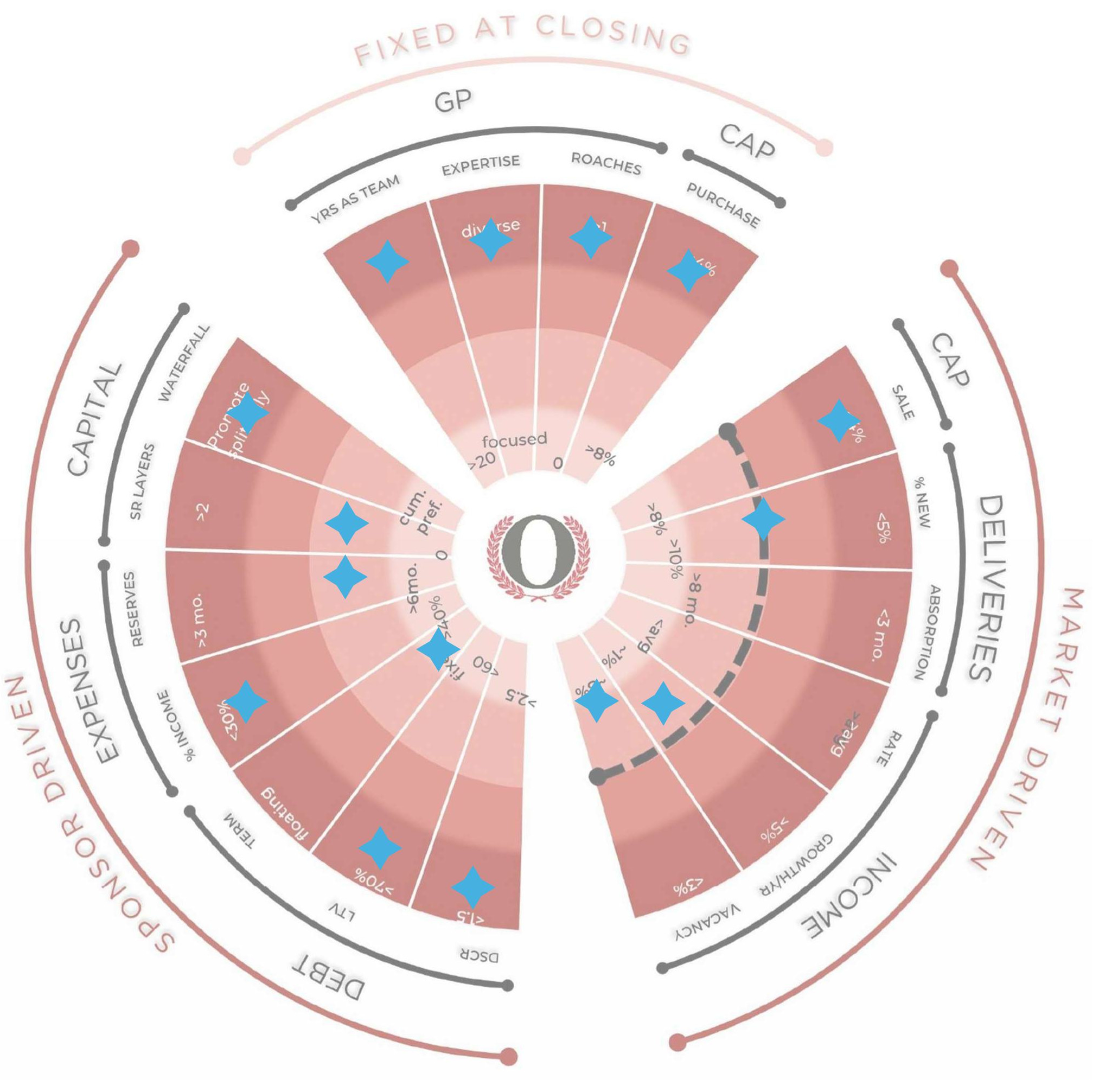
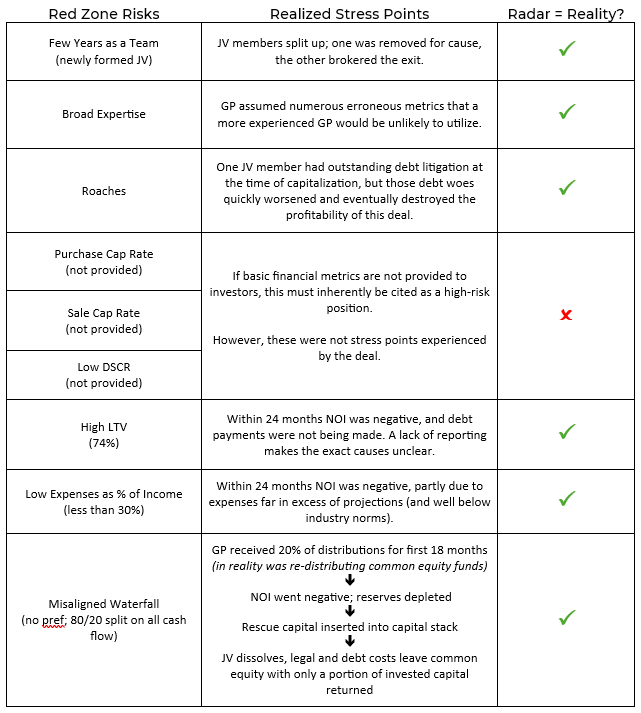
This deal seemed very boring and simple - a generic value-add multi-family using average rent lift metrics. Unfortunately for investors, the inexperience of the GP was the weak point: the offering materials lacked meaningful information, LP interests were grossly mismanaged at multiple points, and capital was ultimately lost. This deal didn’t break on one point, but on multiple points. All of which were visible during capitalization.
Industrial
Note that all metrics are reflective of national long-term averages and industry norms for industrial real estate. The expenses as a percentage of gross income assumes a NNN structure.
Bond. James Bond-like Returns
Opportunistic value-add and expansion of a light industrial property using a well-known and routine value-add and expansion business plan.
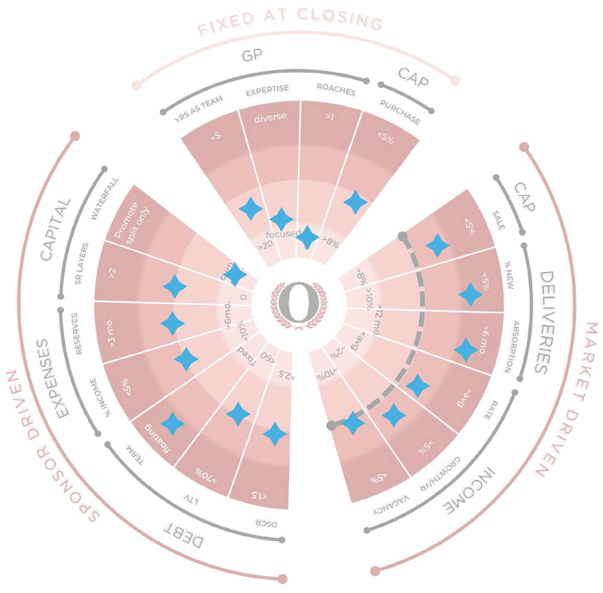
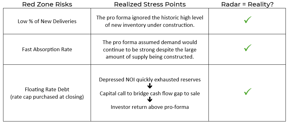
There were several risk points that could have easily killed this deal - assuming strong demand and low debt rates would persist. Both assumptions were quickly proven to be incorrect and were threatening to potentially lead to a certain loss, but the experienced GP quickly swapped the original business plan for an alternative. By making a well-crafted capital call, the GP protected investor interests and delivered returns in excess of the pro forma.
A Real Ringer
Ground-up industrial development by a local GP with a track record that predates CDs, email, and the internet.
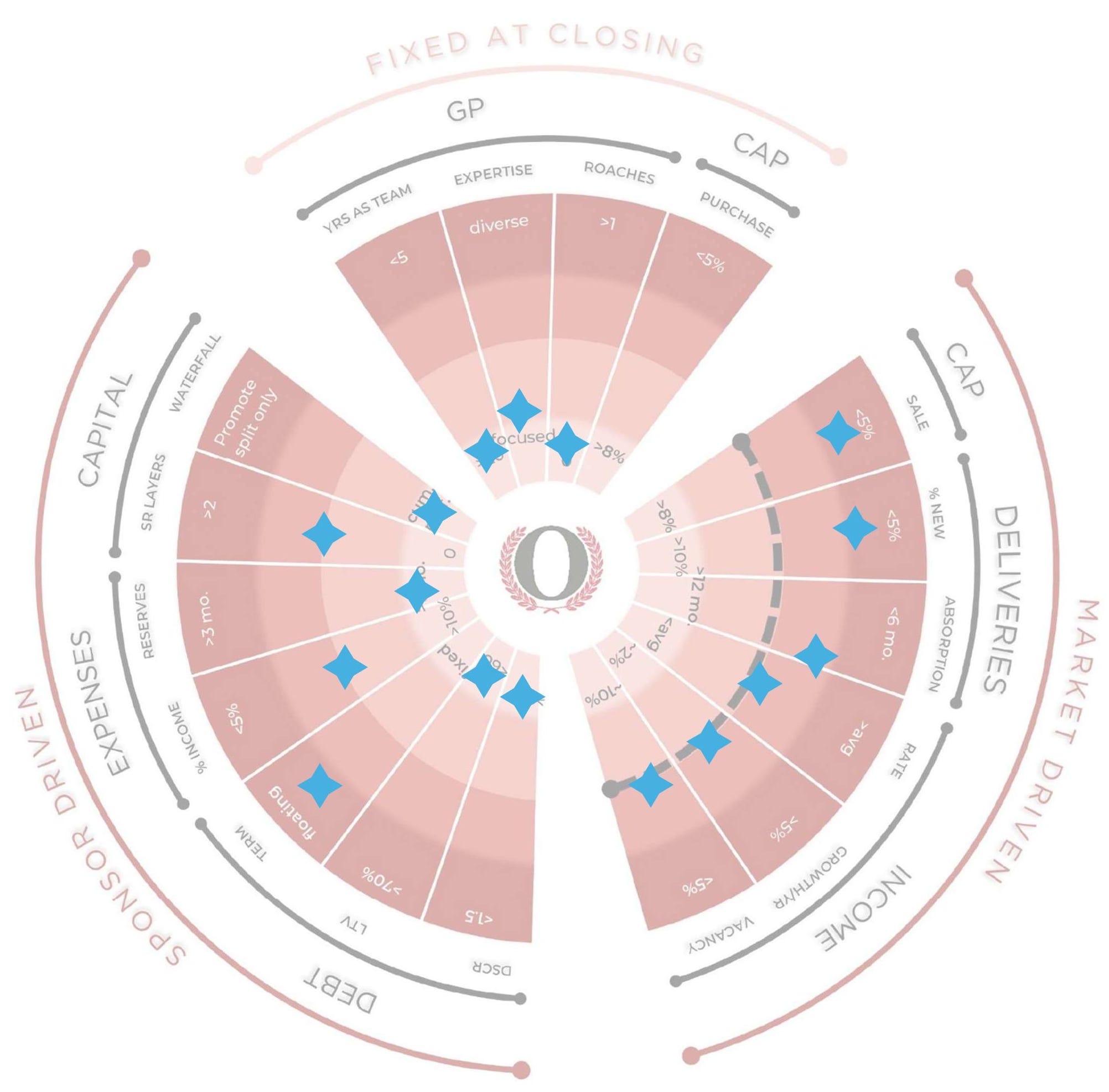
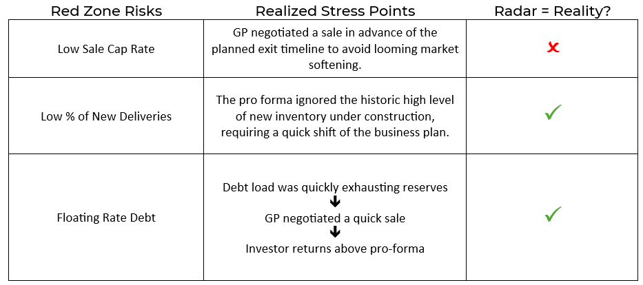
Similar to the previous deal, the assumption that strong demand and low debt would persist could have killed this deal. However, the GP demonstrated real skill in outpacing the softening market conditions to deliver a win while narrowly avoiding a major loss.
The Roaring 2020s…
The Sirens Song + Fantasy Acres
In The Sirens Song, 100 years of regulatory and financial changes that created a frenzy of investment in crowdfunded real estate illuminates how its ultimate collapse was unavoidable - and predictable.
To further illuminate risk, the Heuristics pro forma learning series created the Fantasy Acres project based on underwriting assumptions commonly used in 2021. The hypothetical offering information is plotted here.
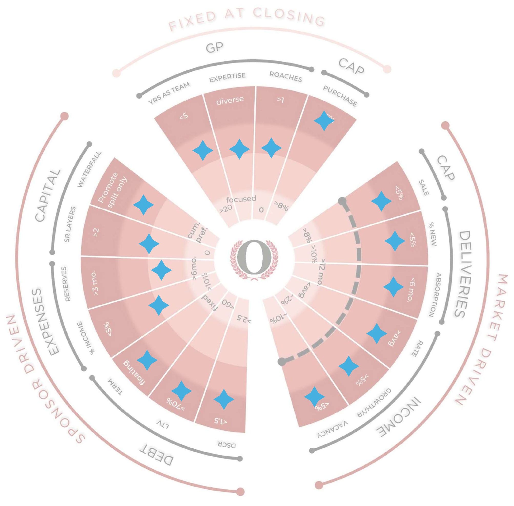
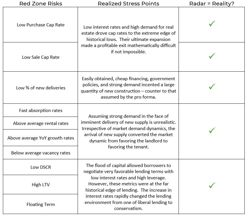
Observe the number of spokes at the outer edge of the radar: cap rates, favorable market demand, and debt were all at the extreme edge of historical rates. This is what the end of a growth cycle looks like before collapsing: rampant investment coupled with metrics pushing the limits of market end points. It is not a matter of if but when the tide will turn. That turn was precipitated by the increase of interest rates in 2022, which directly impacted borrowers’ ability to make debt payments. But was compounded by softening demand that was the direct result of the flood of newly constructed supply. Both factors expanded cap rates, making exit via a sale and repayment of capital a mathematical impossibility.
Any one of these factors has the ability to compromise returns. None should have been surprising. Data clearly indicated assumptions at the extreme edge of the historical range. A reversion was imminent and could have been expected. By late 2021 the Fed was signaling rate increases; the hikes began in March 2022 and ran through mid-2023. By the end of H1 2022, institutional capital flows into real estate dropped from its 2021 peak. Experienced players were aware of and heeding the warning signs. Inexperienced retail investors, euphoric with newly granted access to the “investments of the 1%,” were blind to the risks and continued to pour funds into syndications through 2022 - well after interest rate risk was clear. And ultimately paid the price of ignorance.
The market will always revert to the mean.
Risk ≠ Doom
These examples demonstrate the risk profile of a deal as plotted against historical market data and industry norms, but also demonstrates that just because a deal has one or more high risk points does not mean it will fail. The story is more nuanced. GP skill and favorable market timing can offset a stress point the Radar flags; the deals above show both happening repeatedly. The Risk Radar is a tool to support risk analysis; not a replacement for your own consideration of a deal in whole.
The Risk Radar can’t tell you if an investment is right for you.
But it can tell you the relative risk of each breaking point.
Up Next
Next week I’ll outline how to leverage AI to source the industry data and pro forma assumptions needed to plot the Risk Radar.
Challenge the Radar
Download the Risk Radar and test it yourself: plot the data of the offering materials of an exited or mid-life deal. Does the Radar accurately depict stress points experienced by the deal? What was missed?
Share in the comments below.
This post and the Risk Radar framework are for educational and informational purposes only. They are not investment, legal, tax, or financial advice, and nothing here is a recommendation to buy, sell, or hold any security or to invest in any particular deal or sponsor. I am an individual investor sharing my own framework and opinions - not your advisor or fiduciary - and reading this creates no such relationship.
Risk Radar is a visual heuristic, not a scoring system, a rating, or a forecast. It compares a deal’s stated assumptions against broad historical averages and industry norms; it does not measure or predict any deal’s actual result. A profile that plots toward the center is not “safe,” and one that plots toward the edge is not doomed - the tool is a starting point for analysis, not a substitute for it. Historical norms describe past tendencies, not guarantees, and markets can behave differently than they have before. Any deals referenced are illustrative and anonymized.
Always do your own due diligence and consult your own licensed legal, tax, and investment professionals before making any investment decision.